Superia: colour in the quiet places.
Look beyond the obvious subject: shade, foliage and familiar streets can carry a picture’s mood.
Start with a colour relationship
Try First Sight’s Superia look on a shaded street, a room with plants or a portrait with a colourful background. Pick two colours that already work together. Keep an eye on their relationship as you adjust the treatment. Making every colour louder can remove the difference that first caught your attention.
Pay attention to skin
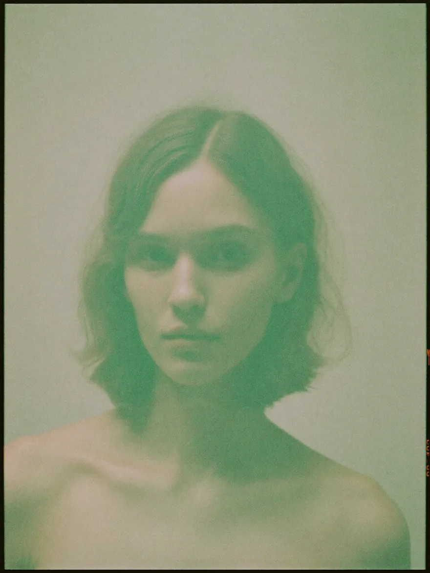
A colour shift that is interesting in foliage may be less flattering on a face. If a person is in the frame, compare the skin with the original while changing strength. Let the background take more of the mood if that helps the portrait. A recognisable look does not need to cover every subject in the same cast.
Let shade have a colour
Shadows do not always need to feel neutral. A restrained colour bias can make a familiar place feel cool, still or slightly distant. Try a version that keeps that feeling and another that corrects it. Pick the one that expresses your experience of the scene rather than the one that follows a rule.
Add texture after the colour settles
Once the colour feels right, compare grain characters on a smooth surface and a detailed one. Avoid making fine foliage so busy that it competes with the subject. Check the picture small. Texture that looks elegant close up can become a distracting shimmer after the image is reduced.
Take the look outside portraits
Photograph a doorway, a bicycle and a patch of greenery on the same walk. Give each picture its own edit while keeping one shared colour idea. This is a practical way to build a visual series from ordinary surroundings without repeating the same composition.