Portra 400: room for the person.
An editing study in gentle colour, quieter backgrounds and portraits that still feel like someone you know.
Begin with a face, not an effect
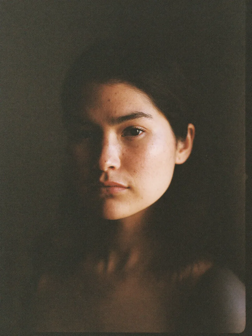
Try the First Sight Portra 400 look on a portrait made in window light or open shade. Look at the skin before the rest of the frame. Does the colour support the expression? A warm picture does not need to turn every surface orange. Let the face be your reference point while you adjust strength.
Keep a little separation
Soft does not have to mean flat. If the subject blends into the background, try a modest contrast adjustment or a different crop before adding more effects. Keep enough difference between light and shadow to describe the shape of the face. Use Compare often; it is easy to forget how much character was already present.
Choose grain for the viewing size
Start with the film’s grain, then compare a finer character at a similar amount. Look at the cheek, the hair and an empty part of the background. Each gives you different information. Judge the finished picture as a small image as well as close up. The texture should read at its destination without becoming the only thing you notice.
One portrait, two moods
Make one version with a restrained treatment and another with stronger grain and deeper shadows. Keep the crop fixed. Which version feels closer to the person, rather than simply more impressive as an edit? That is a useful question whenever a familiar film name starts making the choices for you.
Try it on something else
A portrait-oriented approach can work on a room, a worn jacket or the objects on a bedside table. Look for a small subject against a quiet background. Keep colour gentle, preserve one clear point of attention, and let the photograph carry its own story.