Grain with intention.
Texture should change the feeling of a photograph, not bury the reason you took it.
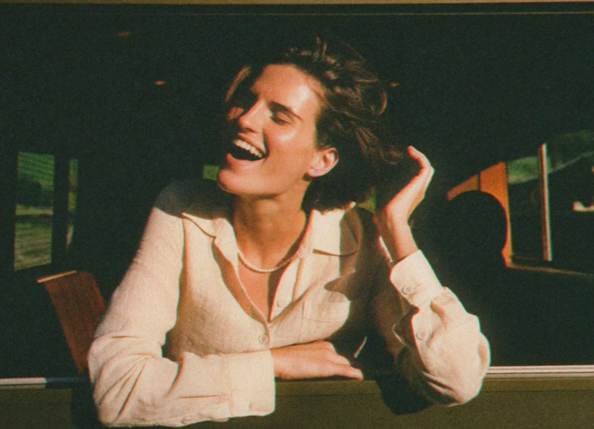
Start with the photograph
Before touching a grain slider, ask what holds your attention. A face? The edge of a shadow? A small patch of colour? Keep that answer in view. An edit can add atmosphere, but it cannot decide what the photograph is about for you.
Choose character before quantity
In First Sight, start with a film stock, then open Grain → Character. Compare two or three characters on the same image. Look at a smooth wall, a midtone and a shadow. Texture that feels gentle in a bright area may become much more noticeable elsewhere. Choose the character that belongs with the image before increasing its amount.
Size changes the mood
Fine texture can leave a portrait feeling intimate. Larger grain can push an ordinary scene toward something more restless or rough. Neither is automatically more authentic. Try an intentionally exaggerated setting to understand the difference, then bring it back. If all you notice is the effect, ask whether that is really your intention.
Judge it twice
Check the photograph close up, then return to a fit view. Finally, look at the exported image at the size people will actually see it. Texture that is obvious while zoomed in can almost disappear in a small post. Heavy grain that looks exciting on a small screen may overwhelm delicate detail in a larger image. The destination matters.
A small exercise
Edit one photograph three ways: almost no grain, fine grain, and visibly coarse grain. Keep the colour and exposure unchanged. Put them side by side and choose the version that best supports the mood. You are training your eye to make a decision, not trying to find a universally correct setting.