HP5: let the shapes speak.
A black-and-white editing exercise in gesture, light and the edges that hold a picture together.
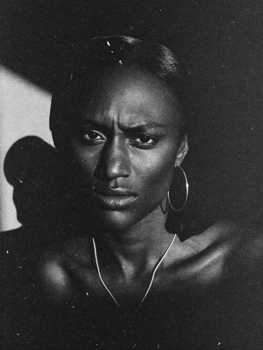
Look for a reason to remove colour
Try the First Sight HP5 look on a photograph where colour is competing with a strong gesture or shape. A hand against a coat, a face against a wall, or sunlight across stairs can be a useful starting point. Black and white changes the information in the frame; it does not automatically make the photograph more meaningful.
Protect the important tones
Choose the part of the picture you most need to read. Keep enough detail there while allowing less important areas to simplify. If a dark jacket disappears into the background, decide whether that helps the silhouette or loses something essential. There is no obligation to keep every surface equally visible.
Separate grain from contrast
Both can make a picture feel rougher, but they do different jobs. Compare a high-contrast version with modest grain against a gentler tonal version with more visible texture. Make those choices separately. This helps you avoid turning every black-and-white picture into the same heavy treatment.
Use the edges of the frame
Watch for a bright corner that draws attention away from the subject. A small crop may do more than a strong vignette. Try leaving a little empty space beside a face or a figure. That space can make a gesture easier to read without adding another effect.
A study to try today
Photograph three subjects in the same light: a person, an object and a patch of architecture. Apply HP5 to all three, then adjust each independently. Do not force identical settings. Aim for a shared feeling that still respects what is different about each picture.